Published December 4, 2020
This article is part of the Flight Test series:
- Flight Test Series Introduction
- Saving Money and Lives in Flight Test
- Data Processing
- Data Storage Options
- UI Design For Flight Test
There are many opinions as to what is a good flight test user interface, and there is some flexibility, especially if the UI will be used in a Telemetry room where preserving night vision (dark adapted sight) is not a concern. For UIs that will be used in flight, strict adherence to aircraft display design guidance is best.
Choosing a Color Palette
The UI color palette must be chosen to reduce eye strain, draw attention to critical conditions, and to not distract the user with unnecessary flashing or bright colors. These considerations outweigh any desire to implement some particular branding scheme.
Background Colors
In the case of ground-based telemetry, it may be best to have screens with a white or light gray background to save on ink should the engineers wish to make print outs of their screens. In the case of flight displays, a dark background works well with light text as this layout reduces eye strain and preserves night vision. Telemetry rooms also tend to have lighting set to a low level so dark screens in general are a good idea to reduce eye strain. A shortcut feature which autosaves screenshot images to folder generally eliminates the concern over printer ink. For the purpose of this article, we will assume that a very dark gray background is used.
Foreground Colors
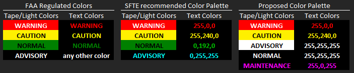
The foreground color palette should be aligned as closely as possible with design standards commonly used on aircraft. The US Federal Aviation Administration provides some guidance in CFR Title 14 Part 25.1322 regarding the use of alert levels and corresponding color codes. 25.1322 requires aircrew alerting systems to conform to 3 levels of crew alerting, the “Warning”, “Caution”, and “Advisory”. Regulations related to color coding state that a Warning must be color coded red, a Caution amber or yellow, and normal operations green. No color requirement is provided for an Advisory other than it cannot be red, amber, yellow, or green. 25.1322 provides definitions for each alert level, but a slightly clearer definition is as follows:
WARNING: Immediate Action Required to preserve the Aircraft.
CAUTION: Loss of redundancy, time limited operation, crew must be informed immediately, but immediate action is not required.
ADVISORY: Non-safety alerts and non-standard operating conditions.
The Society of Flight Test Engineers has also published flight test display guidelines in section 18.2 of their Reference Handbook, Fourth Edition. The SFTE also recommends the use of Red, Yellow, and Green, but goes further to recommend Cyan for Advisory alerts.
Both the FAA and the SFTE color palette present a problem as Red and Green can be easily confused by even mild cases of Color Vision Deficiency. For our use, we will propose a slight change in the color palette to avoid the use of green on the display. We will also standardize on a color for fault reporting, but we cannot use cyan as that color washes out to white in cases of red-blindness and can be confused with a normal condition or possibly an Advisory.
We can simulate color palettes for various types of color blindness using online tools such as this one:
https://www.color-blindness.com/coblis-color-blindness-simulator/
Simulating red-blindness, we see that the FAA and SFTE standards can confuse Normal and Warning without some other supplemental way of differentiating them. All of the proposed colors in the right-most palette can easily be differentiated. This is the case for all common types of color vision deficiency.
Now that we have an acceptable color palette, we can begin designing data indicators.
Displaying Numerical Data
Numeric data is normally displayed with a simple numeric indicator, vertical or horizontal tapes, dial gauges, or graphs if a time history depiction is required. We’ll leave the time histories to a later discussion and focus on numeric indicators and tapes/gauges.
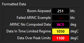
The information displayed in the simple numeric indicator can be greatly increased as shown in the LabVIEW example below. Here we have examples of an indicator that shows the decimal value and limit information via Warning and Caution color coding. Going one step further, this display also supports common ARINC validity states and shows if the data source has failed (—) or if the source is unable to compute the data at this time (No Computed Data), usually because the system is currently performing a Built-In-Test or is otherwise not yet ready for operation.
Dial Gauges and Linear “Data Tapes”
The purpose of the aircraft dial gauge is to show the relative position of the current value to a limit value. To make the same determination from a number, we would have to read the value, recall the multiple limits, mentally compute the active limit, and then compare that to our current value. This takes time and effort which is unacceptable under high workload.
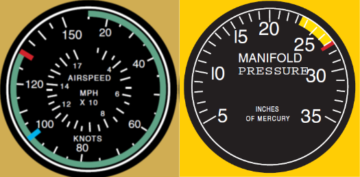
Aircraft dial Gauges are designed to eliminate the mental effort by providing a visual depiction of the relationship. The analog gauges below are excerpted from the FAA-H-8083-21. The gauges shown use two different methods to denote the three operating regimes (normal, precautionary, and prohibited). One gauge denotes the normal regime in green and then provides a limit line to denote the start of the prohibited regime. The other gauge denotes the precautionary regime and start of the prohibited regime, but the normal range is understood. Both depictions are acceptable and a matter of preference. Prohibited regimes should be denoted with a red line and not a red region. This limits the use of red on the display and ensures that any red pixels on the display will be immediately recognized.
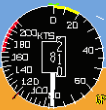
Modern digital cockpits continue to implement similar analog gauge depictions for the most critical data in some applications:
Similar gauges with colored arcs can be implemented in LabVIEW, but it is a bit finicky to get the arcs to display correctly. The following is a multi-needle gauge display example as implemented in LabVIEW. A white needle shows the current value, and the gray needles show the peak values. There are corresponding digital values for current and peak hold as well:

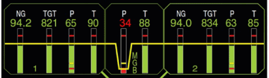
Modern cockpits incorporate a very similar design element called Vertical or Horizontal “Tapes”. These are nothing more than the arc of a dial gauge straightened out to either a vertical or horizontal bar. Here is an example of a production helicopter display that shows system information in vertical tapes. If you look carefully, the yellow and red transitions are shown for each tape.
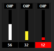
Similar displays can be created in LabVIEW. Here is one example. In this case the yellow and red transition is not shown, but that can be added with some amount of effort. In the case below, the entire digital field is switched to red to draw additional attention to this critical condition and further differentiate the Warning from the Caution.
There has been much argument about which depiction is better for piloting, a digital tape or a digital gauge, and the topic has been given at least some amount of scientific research. Flight test engineers are not actively controlling the aircraft though and such considerations are less important for the engineer’s use. In general, tapes are easier to arrange in a dense array of indicators. The color bands on a tape can be achieved in LabVIEW without the use of property nodes. Arranging colored arcs on a dial gauge in LabVIEW does require the use of property nodes. As such, we cannot arrange fully featured dial gauges in an array, but we can arrange fully featured tapes in an array. Both have been used successfully on flight test displays created with LabVIEW, but the tape tends to be easier to configure at run time than the gauge given that we can implement n length arrays of tapes to be configured at runtime.
Displaying Aircraft System State Information
Modern aircraft are designed with extensive use of digital data buses. A display must be provided to visualize the system status. Many times in the past, displays were created in flight test that showed hundreds of possible individual status bits as Booleans. The method served a function, but there are generally better ways to display similar information. Two common methods that closely replicate flight aircraft displays are the Indicator Panel and the Crew Alerting System.
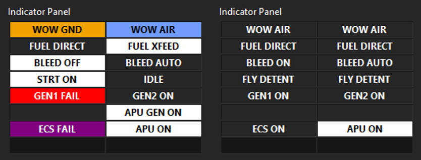
Indicator Panels
The indicator panel shows the current state on a system or component basis. Each box can support an unlimited number of definable states with corresponding colors and text strings. In the indicator panel examples, we see Normal system conditions depicted as white text on a gray background, Advisory conditions as Black on a field of white, with support for Warning, Caution, and Maintenance colors as well as a few additional possible colors. As an example, one box dedicated to the ECS system might cycle between ECS OFF, ECS VENT, HEAT ON, AC ON, MAC AC, and ECS FAIL states. These examples were created in LabVIEW and can easily be configured at runtime.
The indicator panel on the right is what could be expected in flight. The normal operating states are subdued and do not draw any particular attention, while the APU status is abnormal and thus draws some attention to that condition without distracting from any higher priority condition such as a Caution or Warning state. Attention is drawn in order of need.
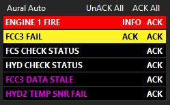
Crew Alerting Systems
The Crew Alerting System, sometimes also called a Warning, Caution and Advisory (WCA) display is an extremely powerful tool for displaying system health information. The display depicted below was implemented in LabVIEW. The CAS display is a ‘by exception’ display meaning that under normal conditions the display is blank. Any abnormal condition is displayed in the color that is appropriate for the severity. Alerts are grouped by severity with the highest severity alerts at the top. Within each grouping, the newest alerts are placed at the top. These displays have the benefit of prioritizing crew focus. They can also be implemented with the ability to acknowledge alerts to clean up the display of known fault conditions. The display below implemented an INFO feature which opens the aircraft emergency procedure for that alert. A full featured text-to-speech aural warning generator was also implemented to alert the Flight Test Engineer over the intercom system of the anomaly. This particular display also supports an additional lower level of alert for maintenance messages. Most aircraft systems implement maintenance alerts on another low priority display. Implementing the maintenance/faults here has proven to be acceptable in a flight test where then engineer can make use of the acknowledge feature to clean up the display. The same may not be appropriate for a cockpit display where a mouse is not readily available.
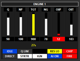
Combining Basic Elements into Complex Displays
The engine display below was created by combining data tapes, status indicators, and a few string displays. These display can be fully configured from a settings file at runtime.
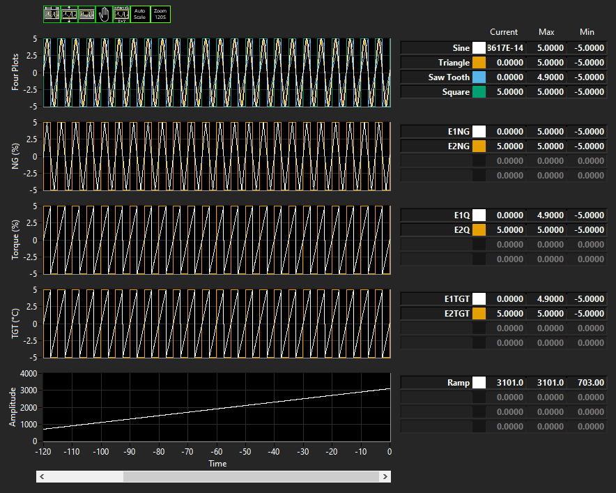
Time History Data
Flight Test displays will make extensive use of graphs. There are many options for these displays, and LabVIEW generally makes plotting fairly easily. The following are useful features for a time history display:
- Easy plot zooming with no more than two clicks to zoom in X, Y, Zoom Rectangle, and Zoom Out
- The ability to group like data for comparison purposes
- The ability to scroll back in time through a previous data buffer
- Easy inspection of the current, min, and max values on the graph
- Easy or default selection of a color pallet which is compatible with common Color Vision Deficiencies
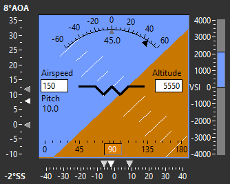
Primary Flight Displays
Primary Flight Displays are fairly easy to implement in LabVIEW. This display uses typical PFD design features except that airspeed and altitude have been simplified from a typical tape display to a simple digital output to save space. This would need to be approved by the end user.