Published July 5, 2018
Most often, our plots only represent one type of information, like one or more measurements vs. time, or two measurements plotted against each other. However there are times when we need to represent more than one kind of data, particularly when we want to show both some raw data and the results of the analysis of that data that ends up having a different fundamental geometry. Now we need to have layered plots, and depending on the application, there are lots of different ways of getting them. Unfortunately, some of the techniques are obscure or tricky, so this article is going to go over a bunch of techniques you might want to consider using in the future.
Graph Annotations
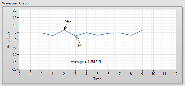
If the only geometry of your new layer is a single point, the waveform, XY, and intensity graphs have an annotation feature that will help. At development time, you can access a dialog to create one annotation by right clicking your graph and looking in the Data Operations sub menu. There are a number of features of annotations that aren’t available at development time but that you can set by using the Annotation List property of the graph at run time.
Image ROIs and Overlays
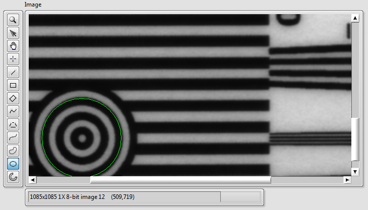
When working with IMAQ images, there are two closely linked features, ROIs and overlays, that are of use. ROIs are editable using the palette of tools but must be converted to non-editable overlays in order to be saved into image files. A nice feature of overlays is that they don’t overwrite the underlying pixels, so they truly are another layer. Their weakness is that while you can display them, there aren’t VIs for reading out their coordinates. If you want to store data for later use, it should probably stay in ROI format and be in a separate file.
Plot Images
Plot images are a rarely used feature of waveform, mixed signal, and intensity graphs. They are 2D picture controls that layer and clip with the graphs. There is only one plot image in an intensity graph, but waveform and mixed signal graphs have three of them so that they can display in front of or behind the data and grid. Plot images are always below the cursor layer.
To use them well, you need to monitor for changes to the x and y scales and adjust your 2D picture accordingly. When doing that math, you’ll probably want to take advantage of two obscure functions, Map Coords to XY and Map XY to Coords, that perform conversions between graph coordinates and pane coordinates. You can create those functions by right clicking on the terminal for the graph and navigating to the Create | Invoke sub menu.
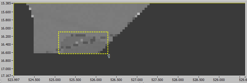
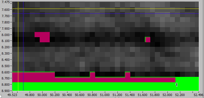
XY Over Intensity Graph
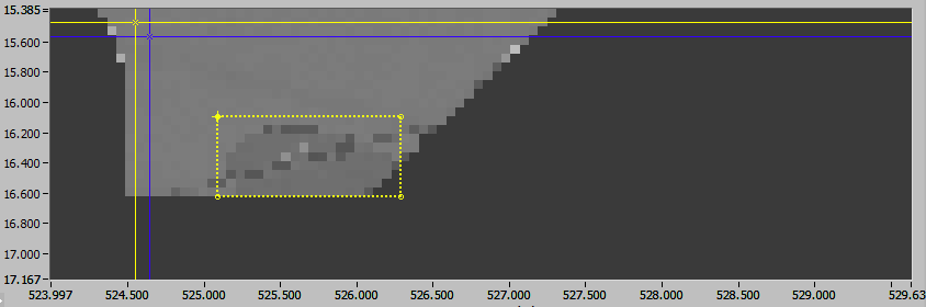
These last two techniques are tricks where two graphs are made to look like one in order to combine features. In this one, an XY graph is carefully aligned atop an intensity graph. The dotted rectangular box which was in a plot image in the previous technique is now just a data plot. Cursors have also been placed at each vertex so that, with some coding behind the scenes, the user can edit the box similarly to how they’d edit an Image ROI. You could do all of the same things with plot images, but this method has the advantage/disadvantage that you block direct mouse access to the intensity graph (and its cursors) while you have the XY graph showing.
XY Over Image
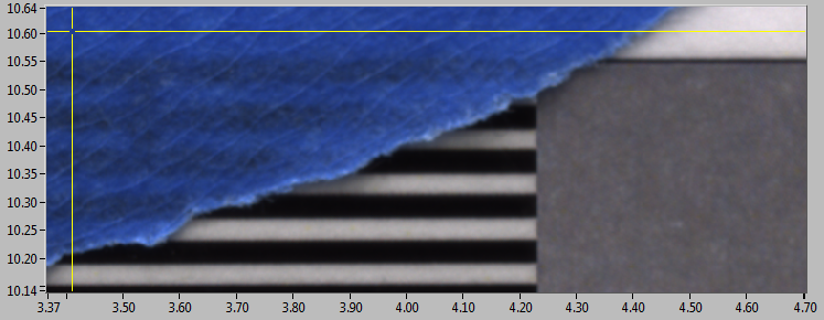
If you are dealing with an application like one of mine where both intensity graphs and color images are used, you may provide a better user experience by overlaying an image display with an XY graph. By doing so, you can provide consistency in scale displays, cursors, zooming behavior, and annotation/ROI editing. If your images are gray scale, it would make more sense just to extract the pixel values from the image and show them in an intensity graph.
Conclusion
With just a little extra digging into the LabVIEW toolbox, you can take your plots to the next layer when that’s where they need to go.