Published August 16, 2012

Introduction
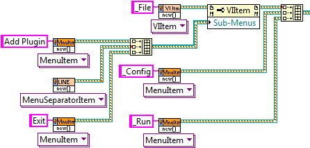
Menus present themselves across many different pieces of software; however they always have a common structure. This common look and functionality are essential in creating a UI that a new user feels comfortable navigating intuitively. The LabVIEW Run-Time Menu editor is a good starting point however it is only useful when the menus will not change at run time. The built in menu changing tools are fairly low level, which leads tends to lead to re-writing or copying similar code between projects. The MGI Menu Building Toolkit eases the task of building and managing menus. It can be used to dynamically generate menus on the fly based on conditions defined by the developer (such as in loading/unloading plugins). It also handles common tasks such as checking menu items on clicks or other overhead tasks automatically. In addition to this, it is easily extended upon using LabVIEW classes to allow developers to build new specialized functionality for their own menus.
Menu Types
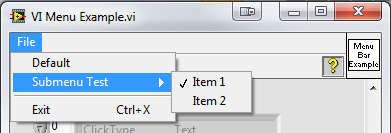
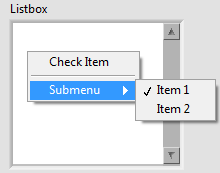
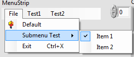
Below are the currently supported menu types. The menu class is designed to be easily extendable to support other menu types, while still maintaining all the other benefits of the menu builder. Each menu type has it’s own example included in the package. See the specific example for more information. Click on the image thumbnail for a full preview.
VI Menu
Replaces the Runtime Menu of the vi.

Control
Replaces the context (right click) menu of the control

Tray Icon
Creates a system tray icon. Requires the .NET Framework
Menu Strip
Creates a .NET Menu Strip.

Selection Types
Below are the currently supported selection types. Like the menu class, selection types are easily extended to allow for custom selection types. Included in the package is an example demonstrating all of different selection types. See this example for more information.
General Selection
Sends a click event every time the user clicks the menu item
Radio Selection
A radio group is specified for each menu item. In each radio group, there is only 1 item that can be checked at a time. Messages are sent indicating both unchecks and checks.
Checkmark Selection
Toggles a checkmark next to the item when the user clicks it. Messages are sent indicating both unchecks and checks.
Toggle Text
The text is toggled between to values when a user clicks the item. Messages a sent indicating a user click. There is additional information in the message class to know both what the old text was, and what the new text is set to.